

MID-CENTURY COLLECTION
The Mid-Century design movement flourished post-World War Two, looking to the future with a desire for modernity, simplicity, and change. It is epitomised by a focus on functionality without unnecessary clutter, organic shapes and clean lines prevail.
It is a Studio Anika signature look, as we always look to refine and clarify our designs. There is some curved detailing to add to its bold simplicity, and bring impactful beauty to this typography.
White space is important in balance with such timeless typography, and we play with italics and bold script for eye-catching moments.

Curated balance of white space in complement to clean, organic, functional typography
This typography is refined, elegant, and clean. It’s the perfect pairing to bring elegance to an otherwise more romantic and informal aesthetic, again playing in the balance that’s an inherent part of the collection’s success. Mid-century uses a modern font which nevertheless looks to classical design and tradition; it epitomises the idea of a ‘modern classic’ - timelessly organic yet modern, the perfect complement for an aesthetic guaranteed not to date.
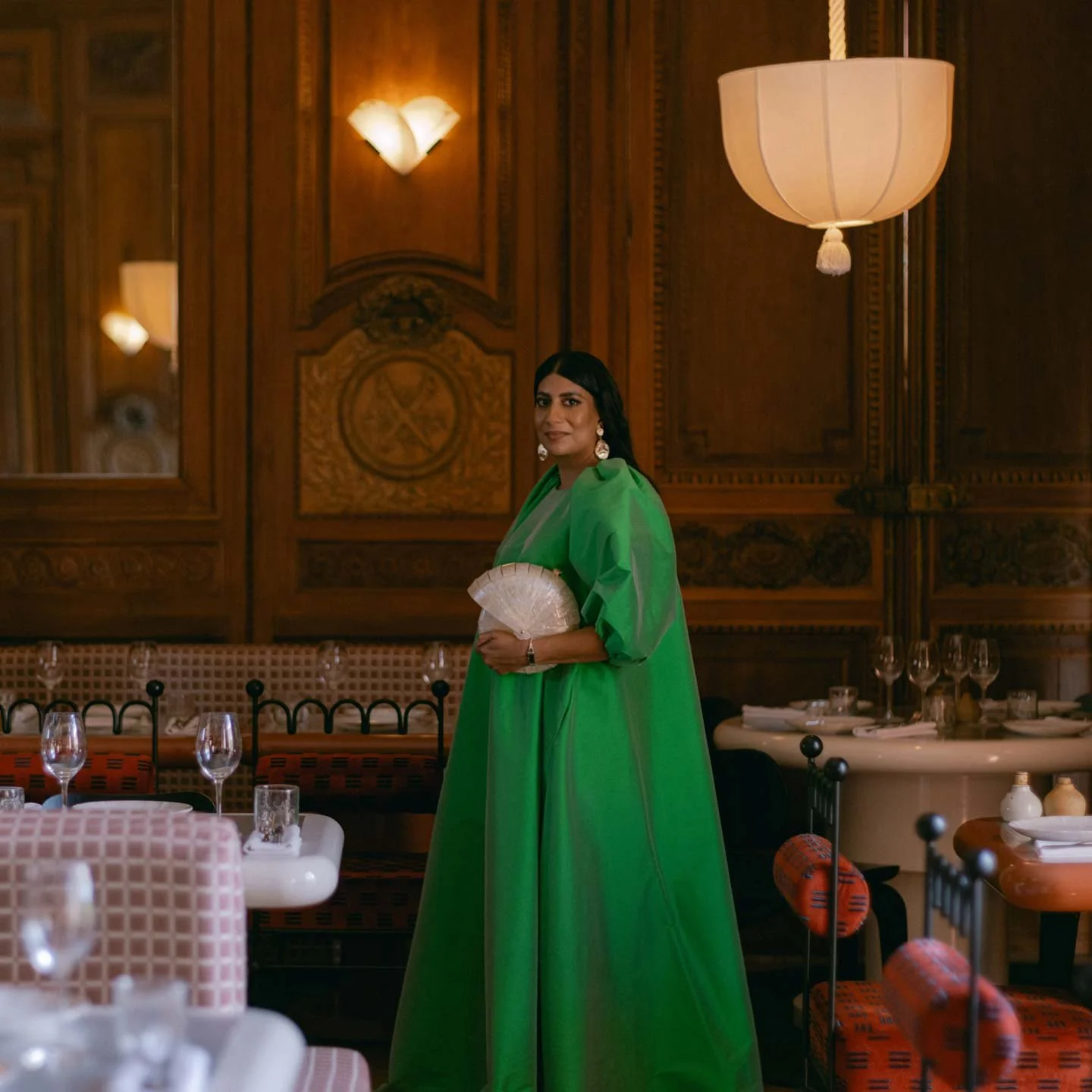
It’s an equally great choice to reinforce a sense of grand occasion and spectacle. If you intend to design your once-in-a-lifetime celebration with decadence and opulence in mind, and your venue is a majestic space or a piece of historical architecture, this collection maintains that level of heritage, tradition, and elegance.

